Synced Cancer Initiative
She was running an organization on five platforms. Now she runs it on one.
A youth-led initiative giving Nigerians the information they need to triumph over cancer, through education, outreach and advocacy. I led the design and the development. The public facing site, the infrastructure, and the management dashboard. Solo.
- Client
- Synced Cancer Initiative, Ibadan
- Role
- Designer and engineer, solo
- Went live
- 2 September 2026
- Surface
- 15 public routes, 16 dashboard routes
- Stack
- Next.js 16, tRPC, Drizzle ORM, Neon, BetterAuth, Cloudinary, Netlify
- Design
- One Pencil file, 51 numbered boards
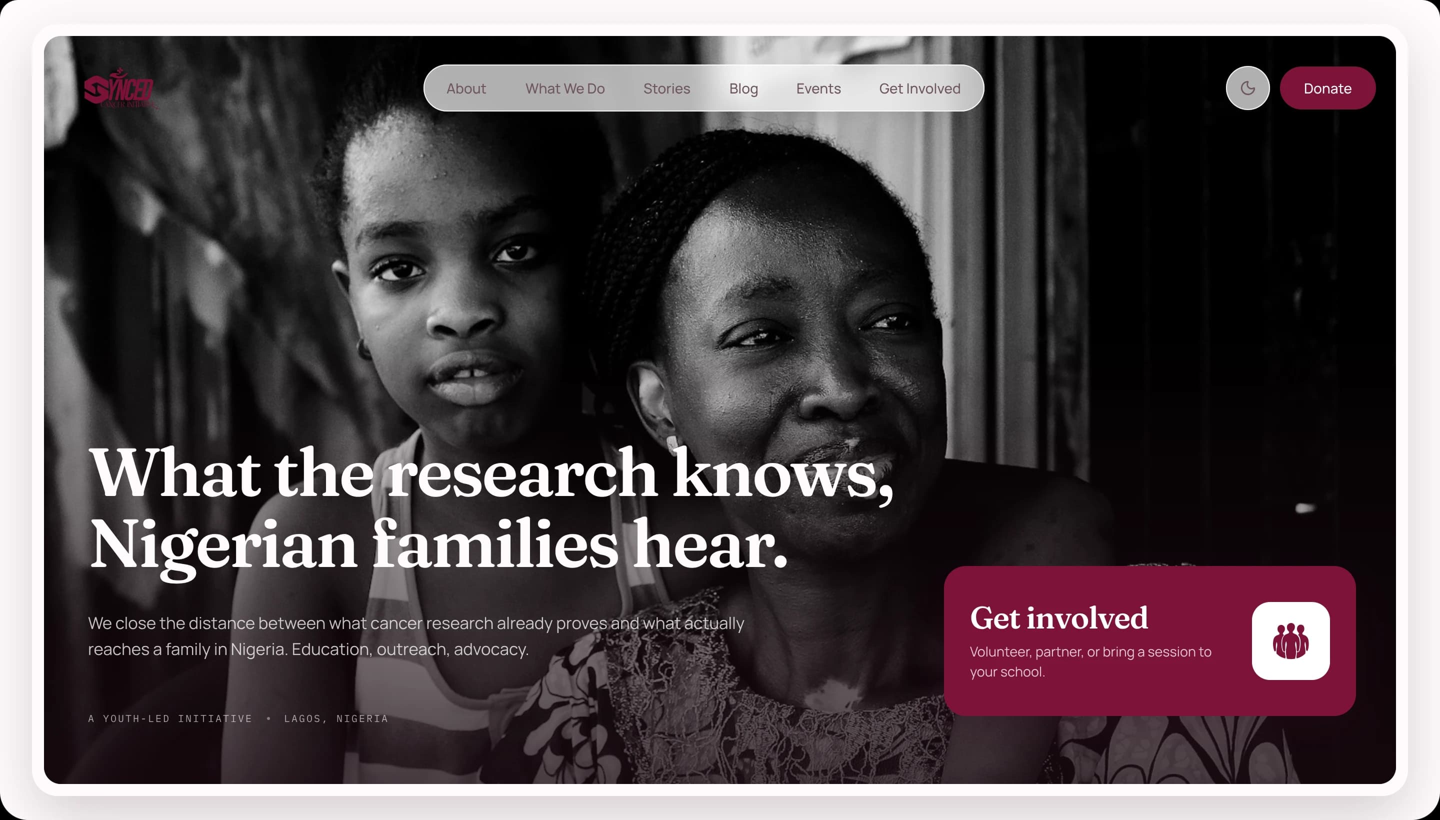
The colors
I didn't think I could do this one.
Pink and crimson. I had never worked on something so bizarre, with a bizarre color palette.
Twelve days later it was live.

The org
What Synced Cancer actually does.
Synced Cancer is a youth-led initiative geared towards providing the information Nigerians need to triumph over cancer. Breast cancer, everything. Through information, education and outreaches.
Nigeria does not have a cancer information problem in the abstract. It has one in the room. Someone finds a lump and does not know whether it is urgent, who to tell, or what happens next, so the question sits there for months. Synced Cancer works upstream of all that. It goes into schools and communities and closes the distance between what the research already proves and what a family actually hears.
I led the design and development of the new experience and platform. The public facing site, the infrastructure, and the management dashboard.
It went live on the 2nd of September.
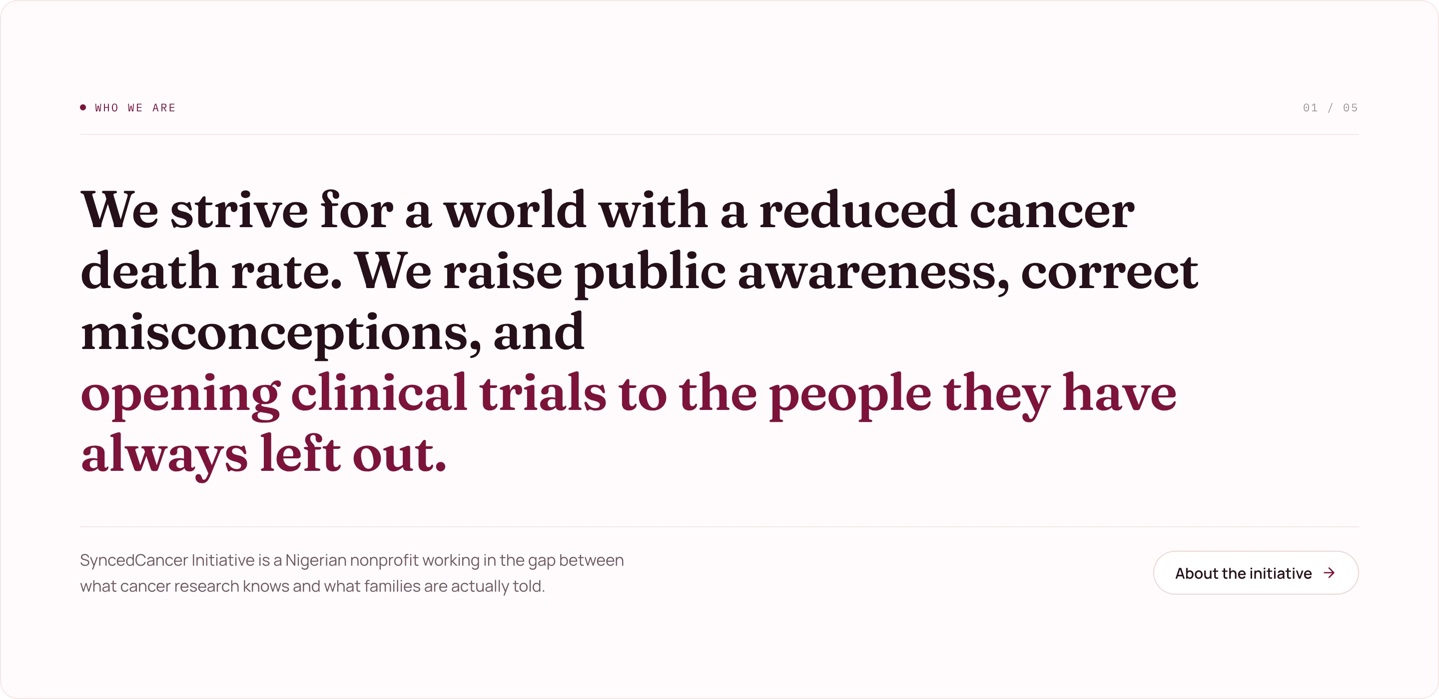
Before
She was juggling five platforms.
Like most every client I have worked with, Synced Cancer had a platform already. A website built by the founder, Oluwatobiloba Dorcas, on WordPress. Self-hosted, fragmented, and she was using a template, so you already know how it looked. Honestly, terrible. It looked more like her personal website.
And it was fragmented. Donations somewhere, forms on Monday. So in order to run her organization she was juggling like five platforms.
The pitch
The challenge was not the design. It was winning Dorcas.
She had to want to invest in a new experience before any of it mattered. It took a cold email, written by me, laying out what her current site was costing her and how I could help, and plugging my most recent work, ICCA Nigeria. I am not a novice at building NGO platforms.
The email got her attention. ICCA cemented it, fully opening the door and giving her a chance to give me a chance.
We hopped on a brief call after and aligned on everything, except the pricing. Small back and forth, then we reached something worthwhile for us both, and we began. She provided every detail I needed, which, I cannot stress this enough, made the whole process insanely easy and stress-free.
I already built ICCA. I knew how the logic would work. But how would it LOOK?
Foundation
I opened pen in my VS Code and started prototyping.
My workflow is to work on different components of a site and then build multiple statement components, the ones that drive the whole thing even when I am not feeling it. So that is what I did. Navbar, a mega menu, then custom icons, then the hero.
Four navbars before one felt right.




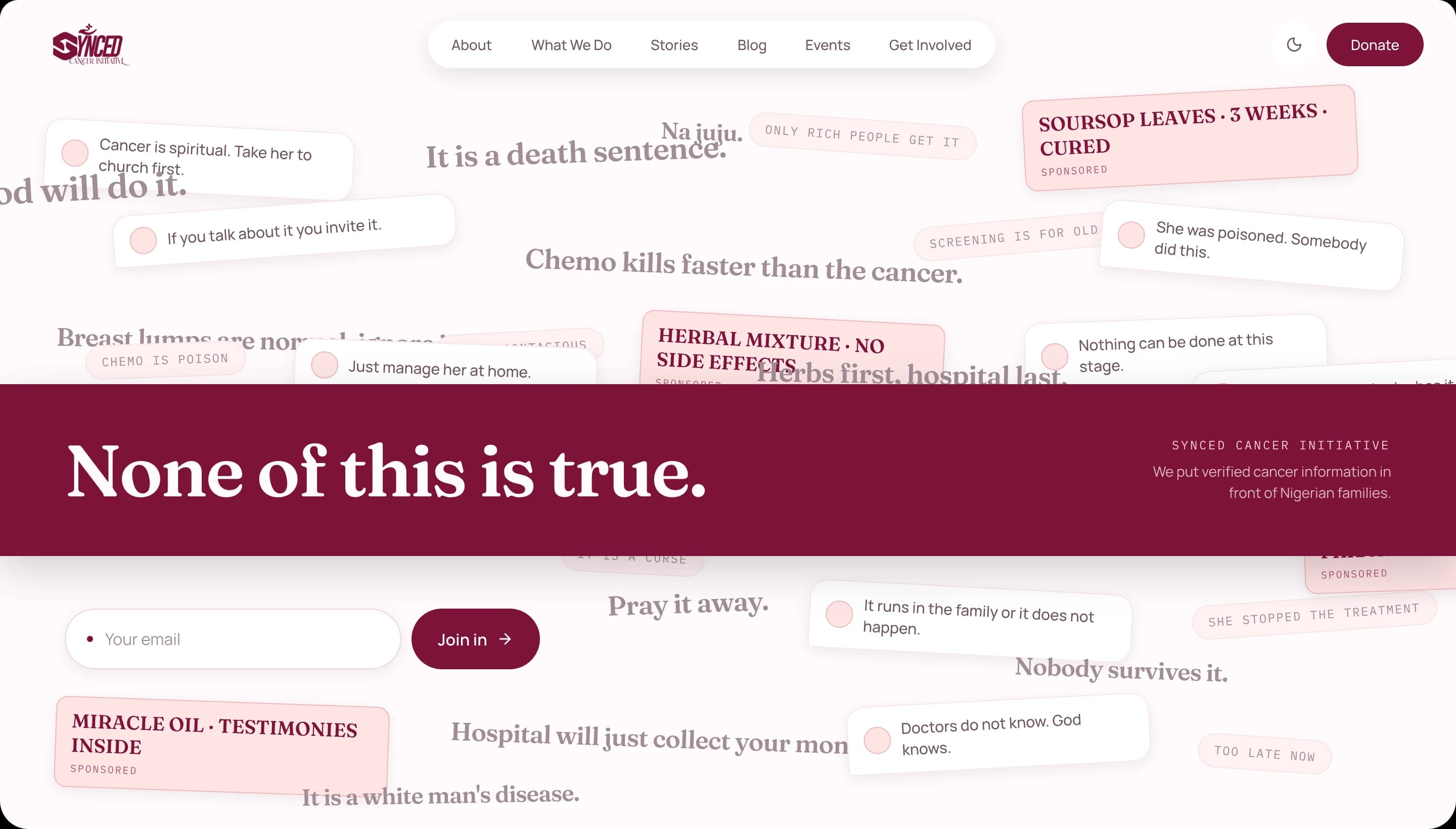
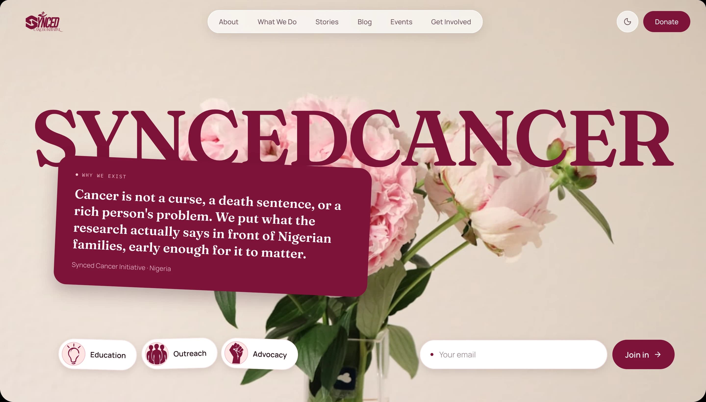
Six heroes
Then the hero. The thing every visitor sees first of all.
I took my time. Maybe too much time, because I churned out six variations of the hero section. Each one re-imagined. My ideas, Claude's ideas. The one I eventually settled on was like the seventh iteration.
Then I realised time was going, because that alone took two to three days.
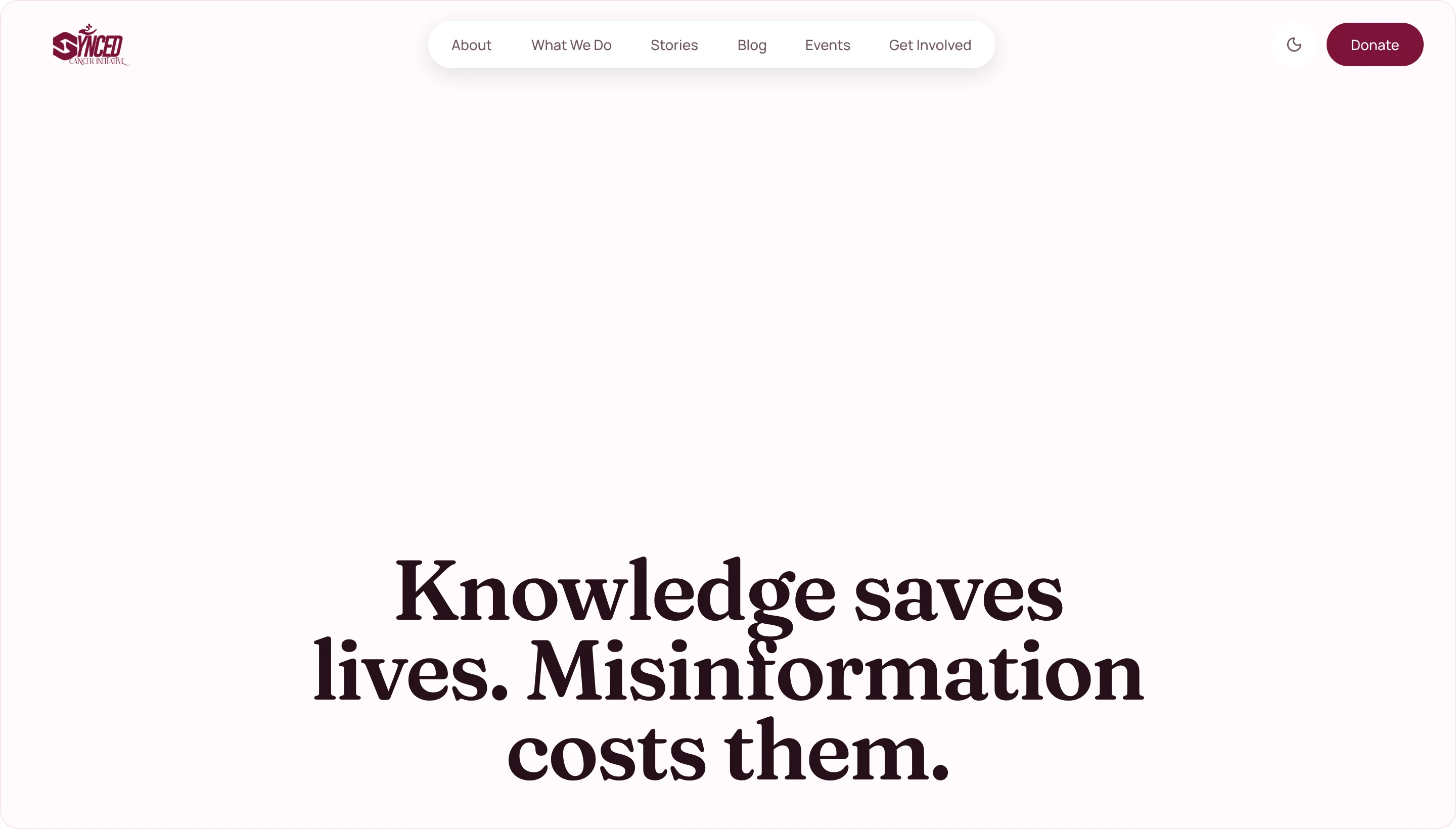
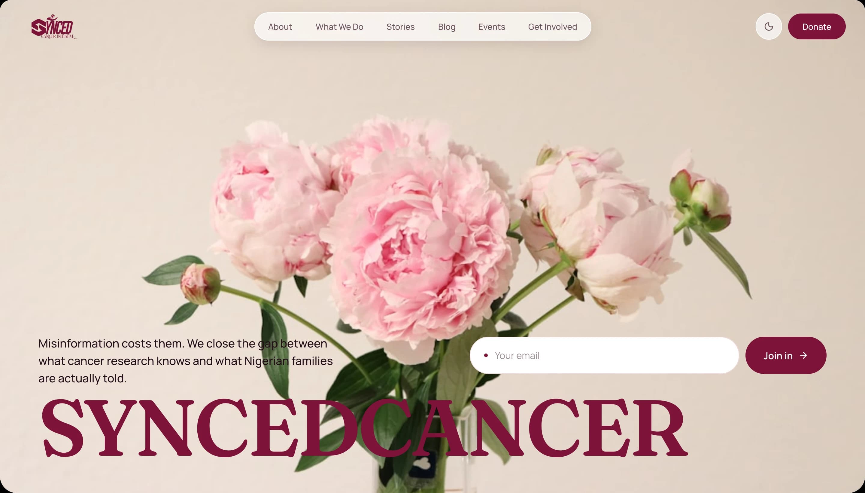
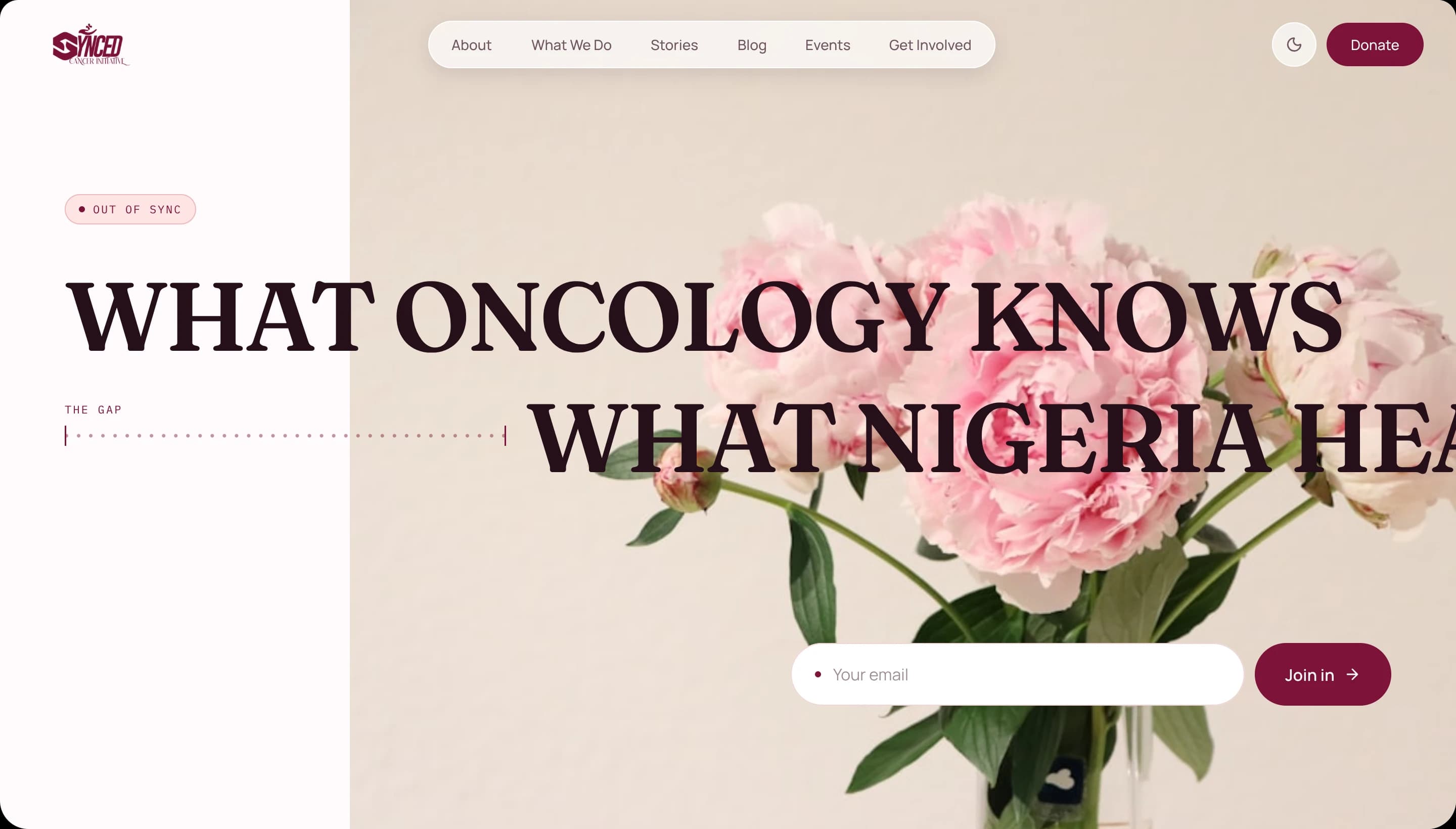
1 / 6 · 01 · Anchor title
Drag the deck, or use the arrow keys.
Icons
This is my icon and this is my language.
I was big on custom icons. They give the site a certain feel. Not a library glyph that ten thousand other sites are also running, but a mark drawn for this organization and nothing else. You get me?
Nineteen of them, drawn on the same canvas as everything else. Fifteen carry the programmes and the values, drawn in wine. The four social marks are drawn in white, because they only ever appear on the dark footer, so they are shown here the way they actually exist. Then the inline chips they sit inside.
 Awareness
 Nutrition
 Living
 Caregiver
 Mental health
 Trial
Trial Vision
 Mission
 Nigeria
 Advocacy
 Compassion
 Equity
 Community
 Presence
 Told
Told Instagram
 LinkedIn
 X
X YouTube
Restraint
It is not a personal site.
Some ideas did not even get to the drawing board, because I had to keep in mind that as much as this is a youth-led org led by a lady, it is also an NGO site. It should not do too much.
Too much movement cannot be allowed. Scroll interaction animations were out of the window as well. It is not my project. It is client work.
Which is why this page moves more than the site it is about.
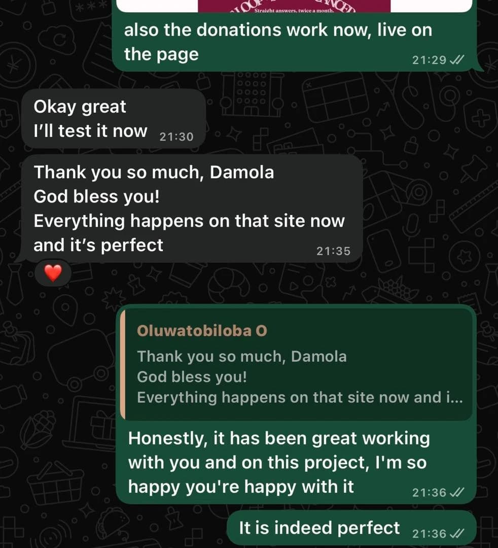
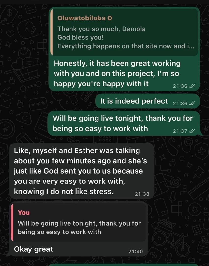
The reaction
She sent it to her sister immediately.
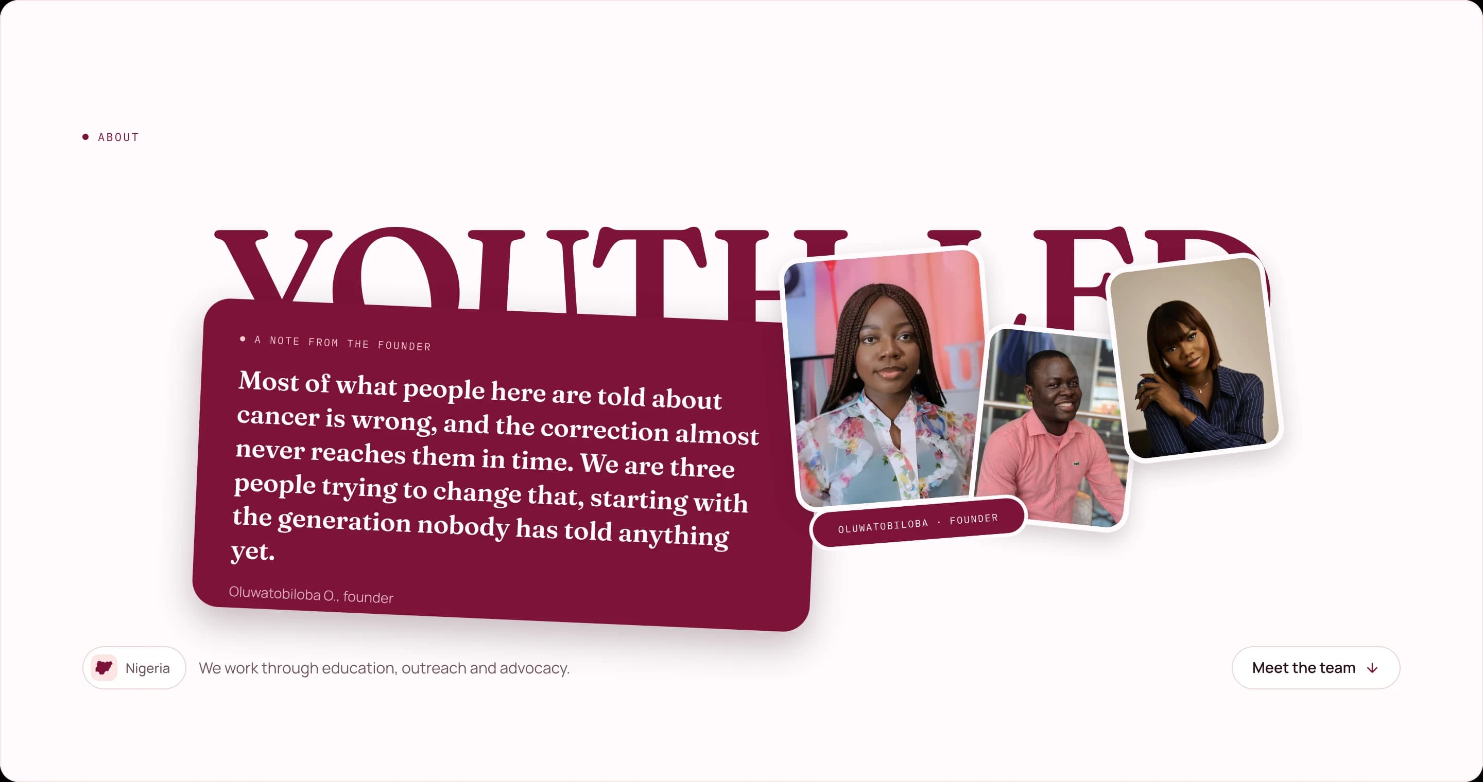
I kept the fun feel, confirmed by Dorcas herself. It feels just RIGHT. Fun enough, and serious enough for a grant giver to give a grant. It feels YOUTHFUL, and I was so happy I nailed it.
We hopped on a call after I sent her the staging link to look at the homepage. She said she absolutely loved it, and she sent it to her sister immediately.
That initial client love for your work is so insane. I will never get tired of it.
Statement pieces
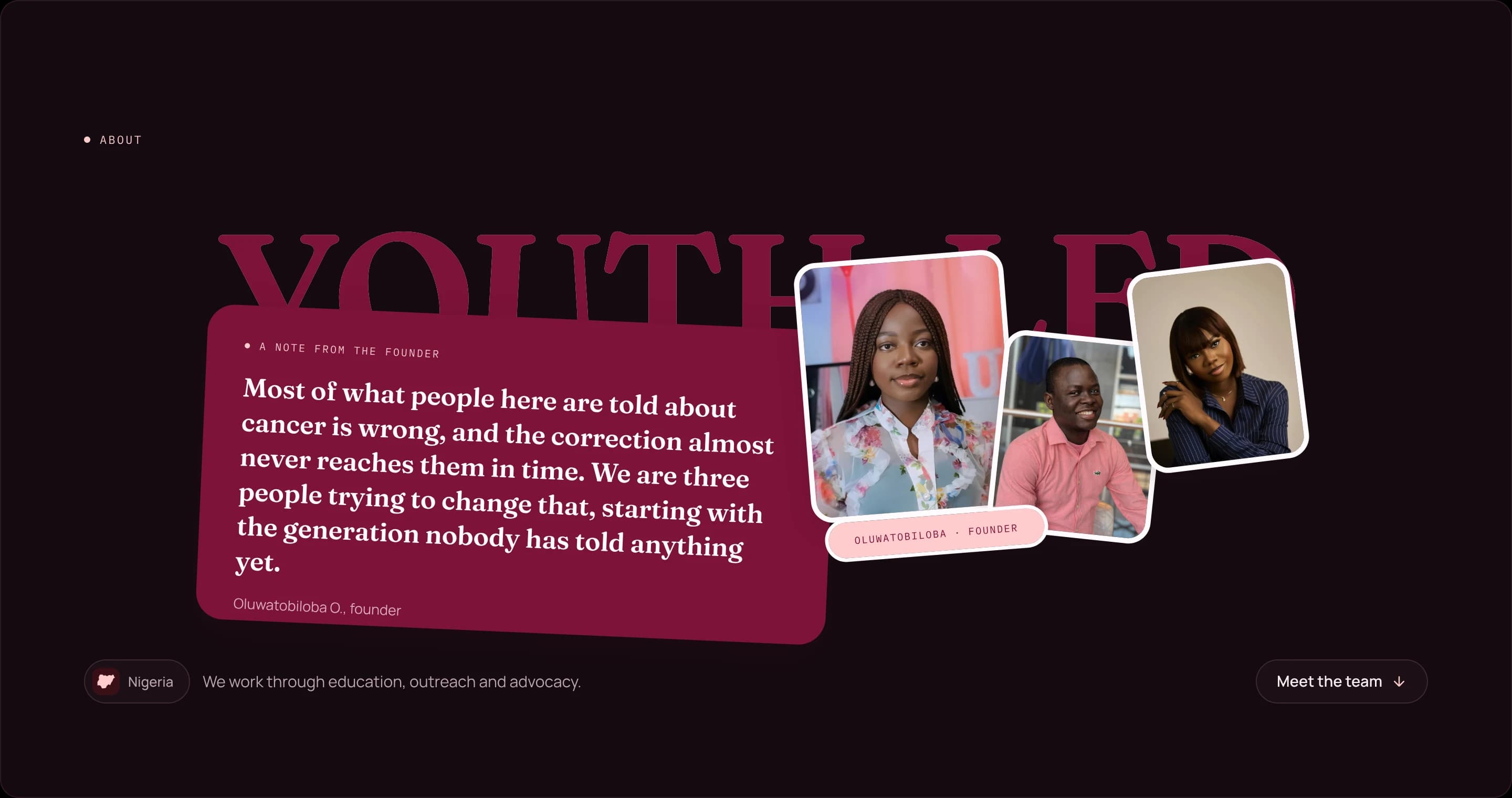
Then I kept moving. The about page, bam.
Amazing stuff, and a lot of statement pieces there. Then the school outreach programme page. Statement pieces everywhere, while still keeping myself in check.
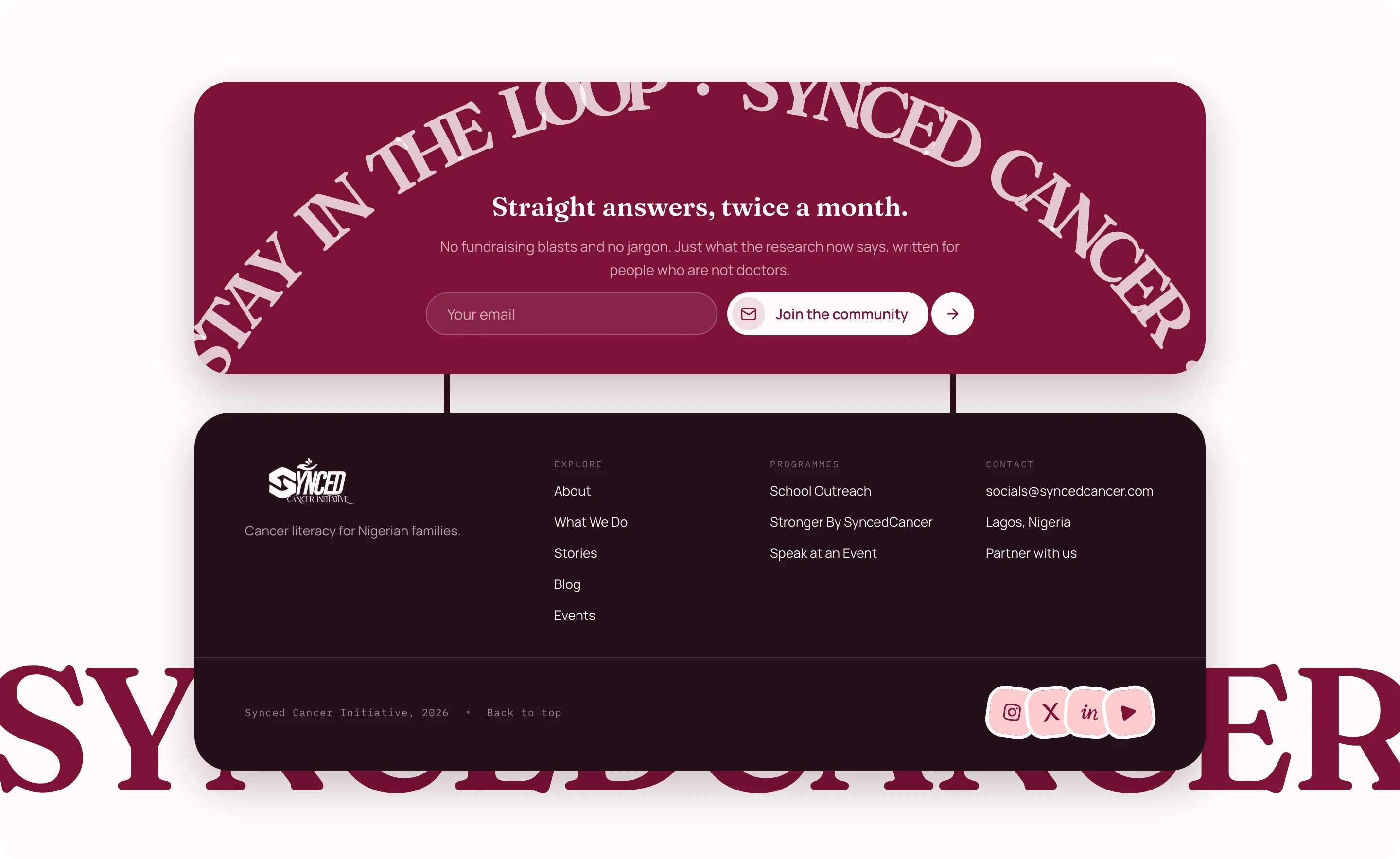
The footer was a statement piece too.
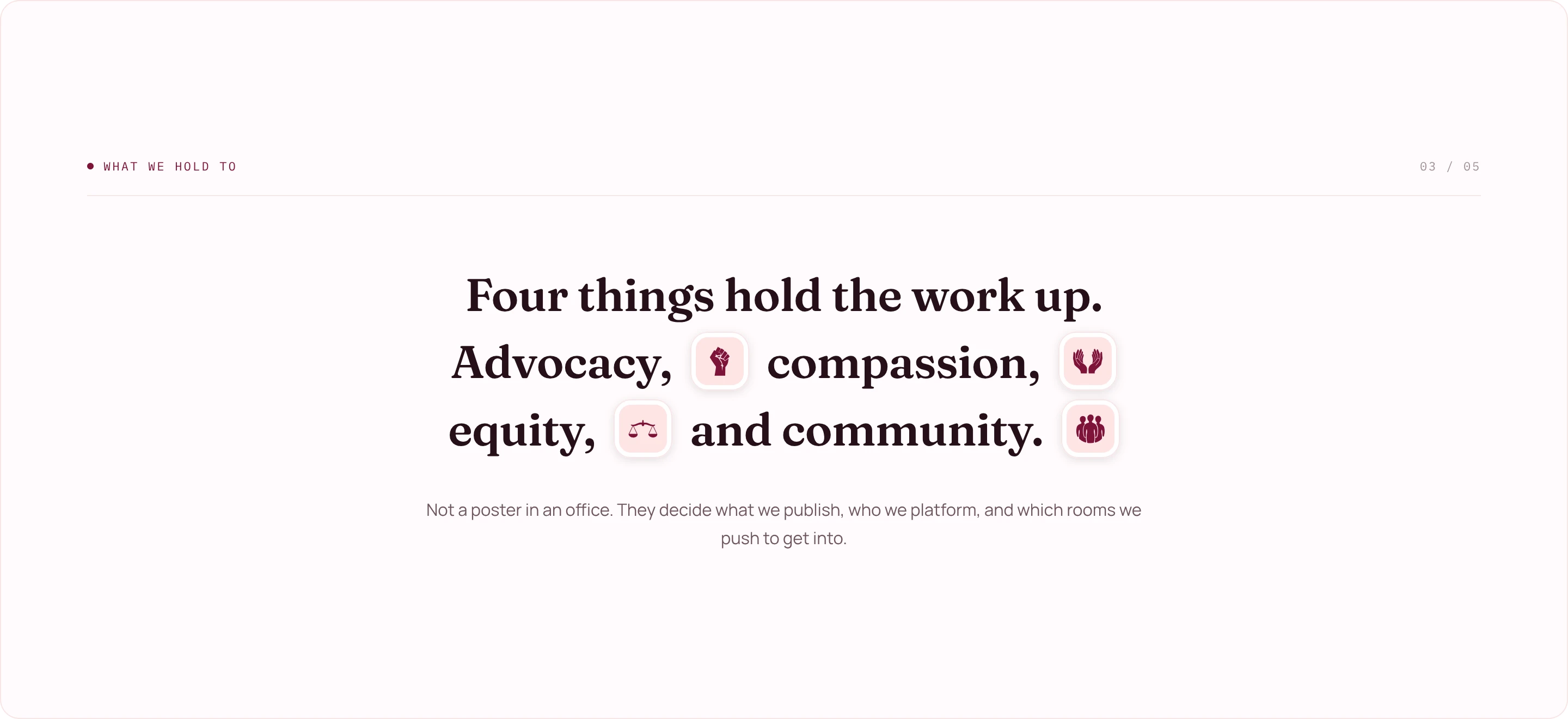
The icons from the last block, set inline in a sentence. That was the whole reason for drawing them.
The colour swap
Also I missed this. I got the colors wrong initially.
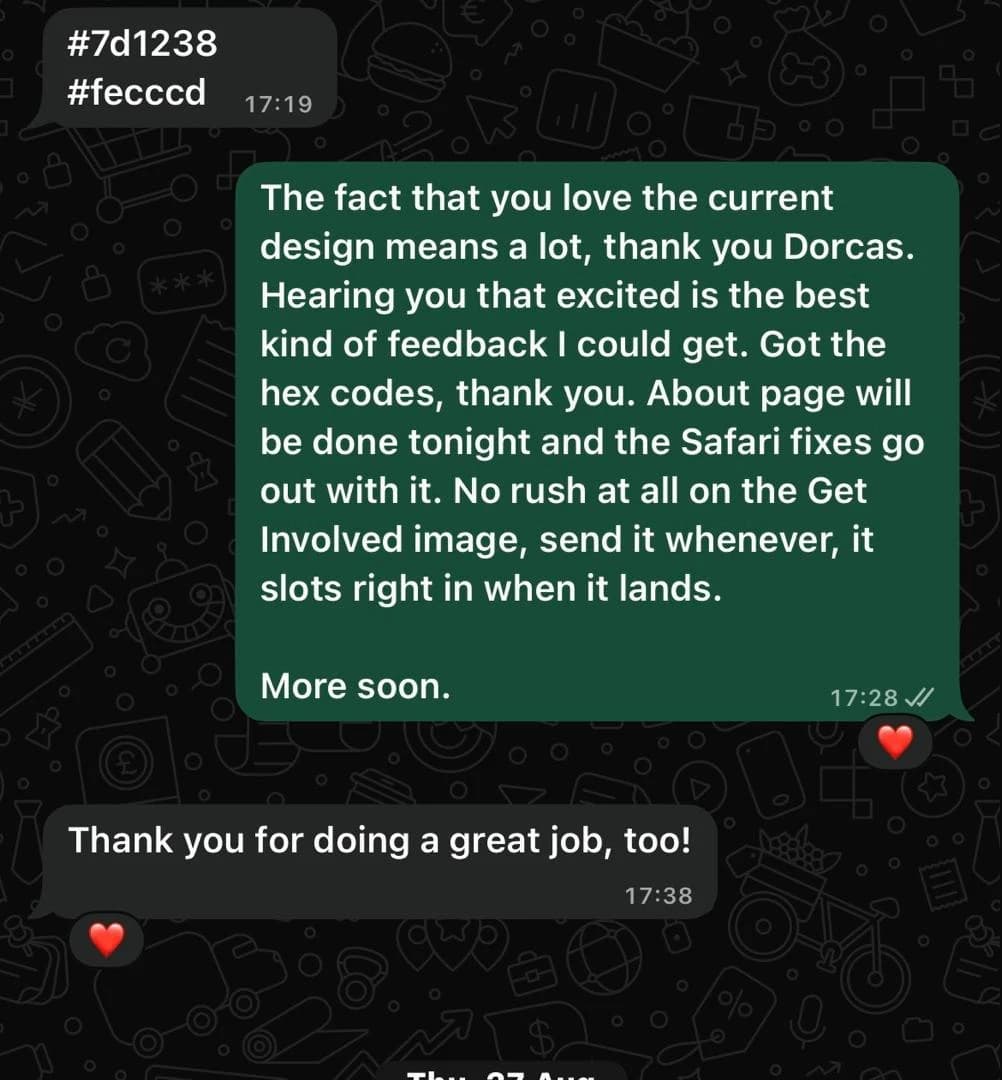
Total breeze. Dorcas sent the hex codes over, I swapped them in, and it was no issue at all. It propagated across the page.
That is the whole payoff of building on tokens instead of typing colors into components. Two values changed and every button, chip, border, hover state and dark surface followed, including the ones I was not thinking about at the time.
The two I had been working with are still on the swatch sheet at the top of this page, filed under Retired.
The interaction
I tried a new sliding mechanism for the button.
The structure and the design, and most especially the mobile version. It was incredible, and so smooth.
It is not a cross-fade and it is not a rotation. Two discs ride one track inside a circular casing that clips them, and pressing it slides the track by exactly one casing width. The menu disc leaves through the left edge at the same rate the close disc arrives through the right. Halfway through you get two half-discs, which is the frame that makes it read as one object passing a porthole instead of two icons trading places.
Casing 58, disc 48, five pixels of white all round. This one is live, not a picture of one.
Press it

Iterating
I iterated like five versions of one section.
Adjusting, or might I say iterating, really was something in this project, and it is ultimately what took my time. Moving things around, trying every idea I could to reach the absolute perfect version that fits that section, and the page, and the design direction, and the product.
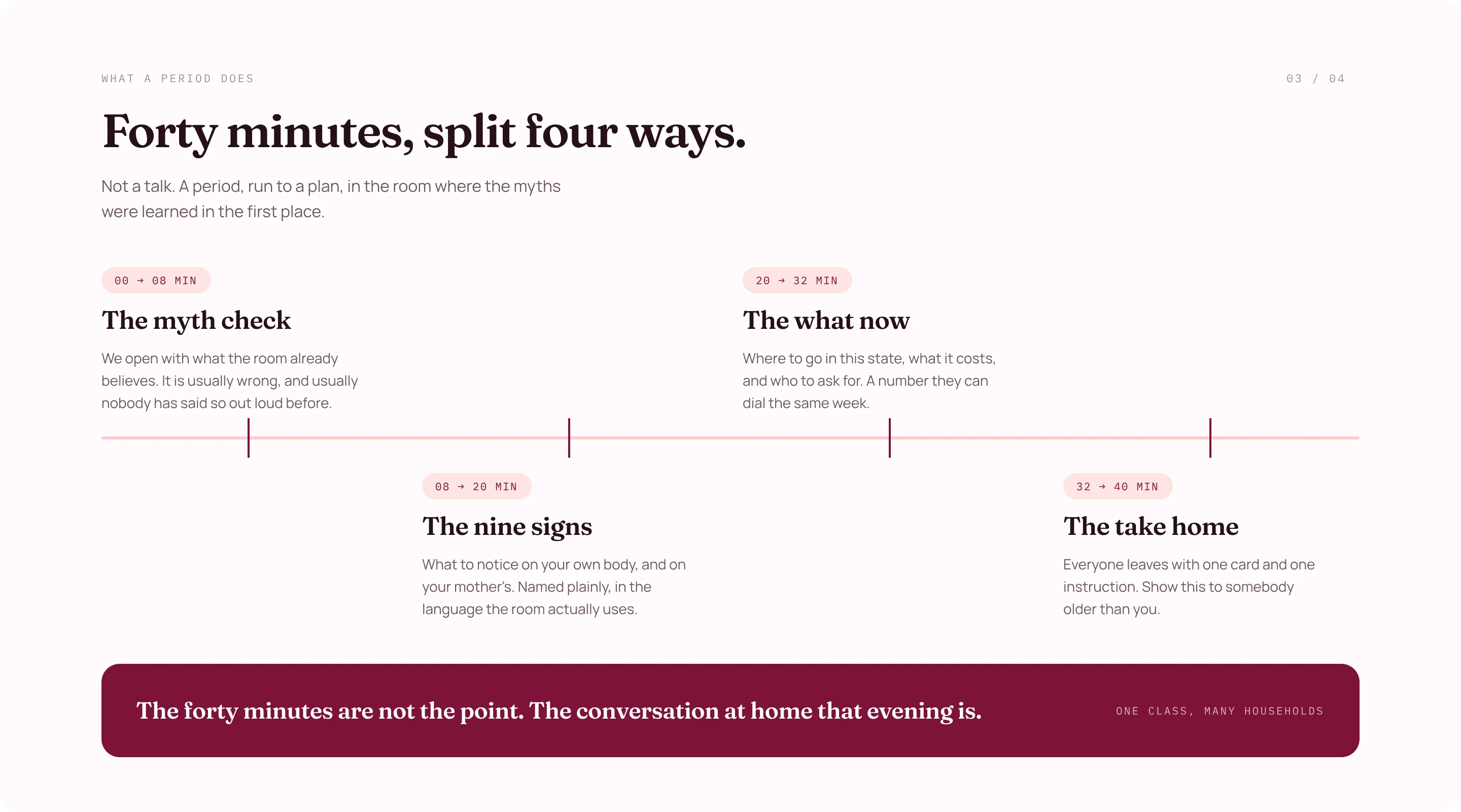
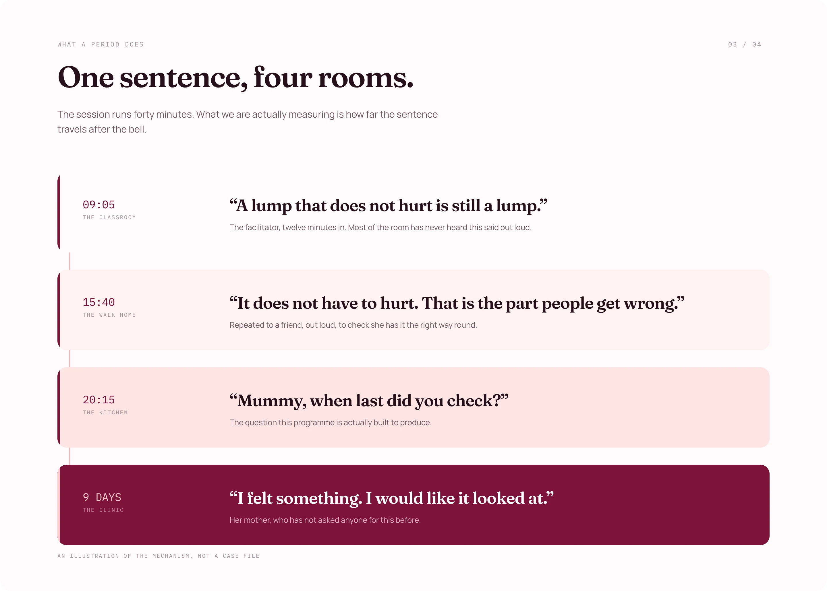
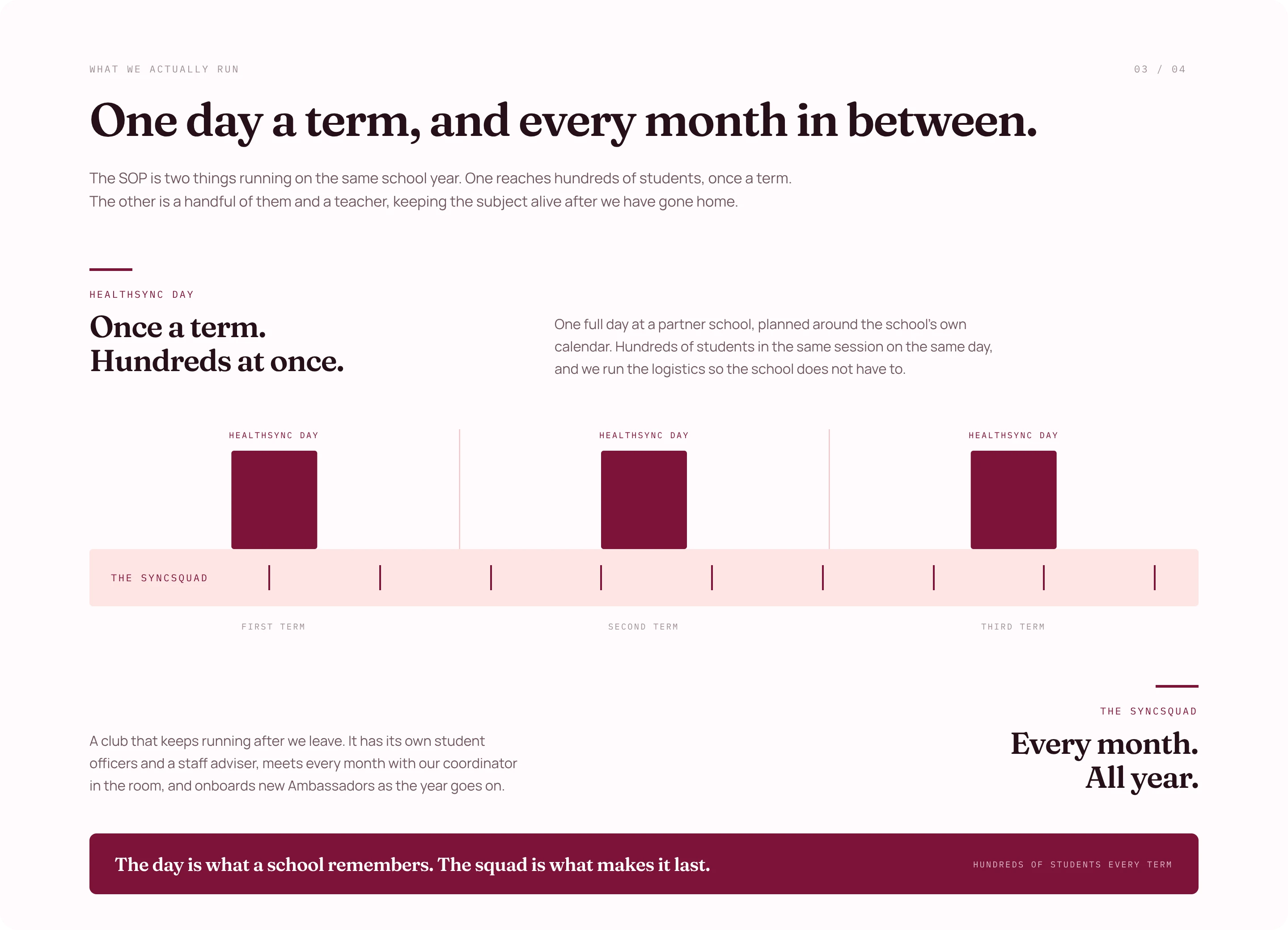
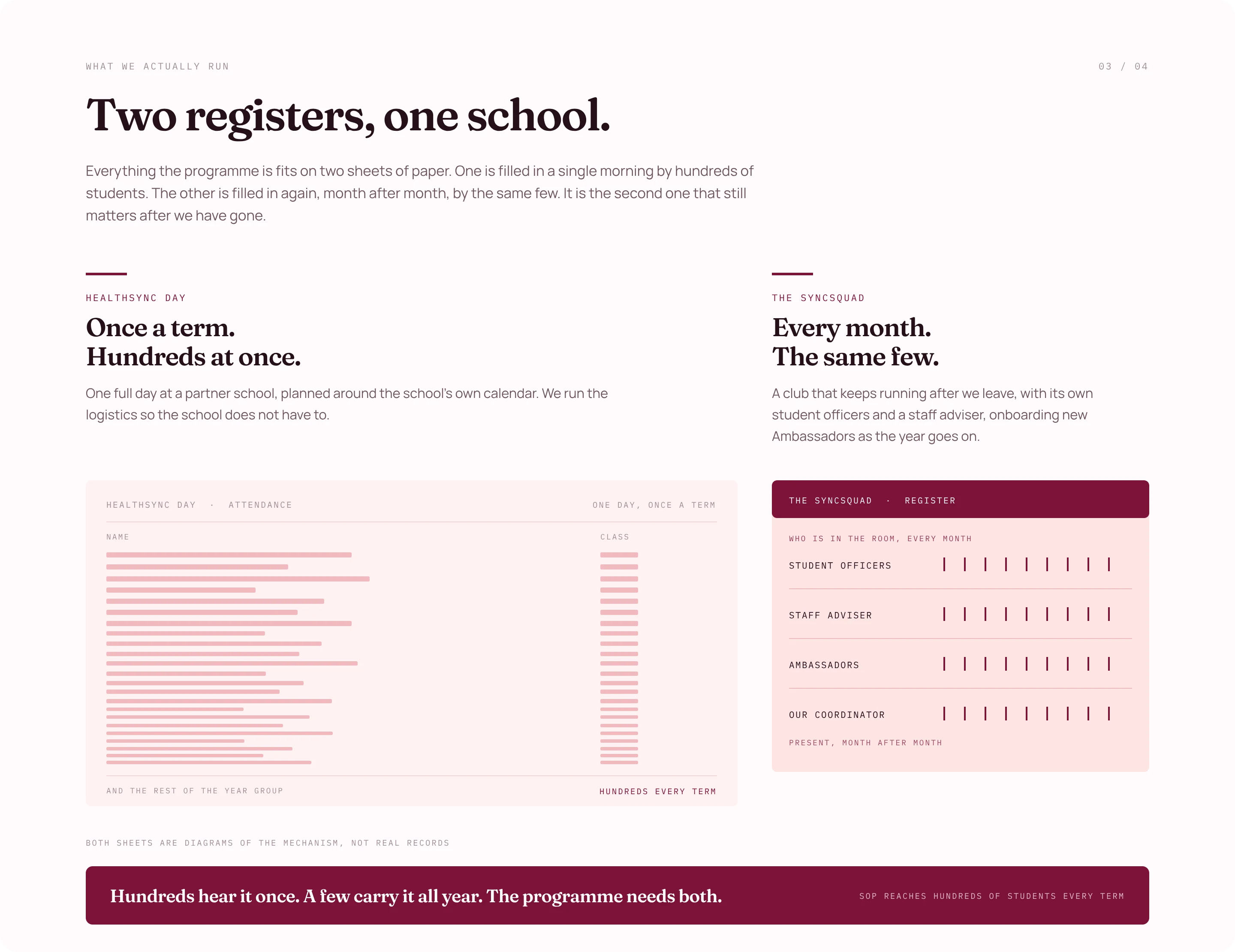
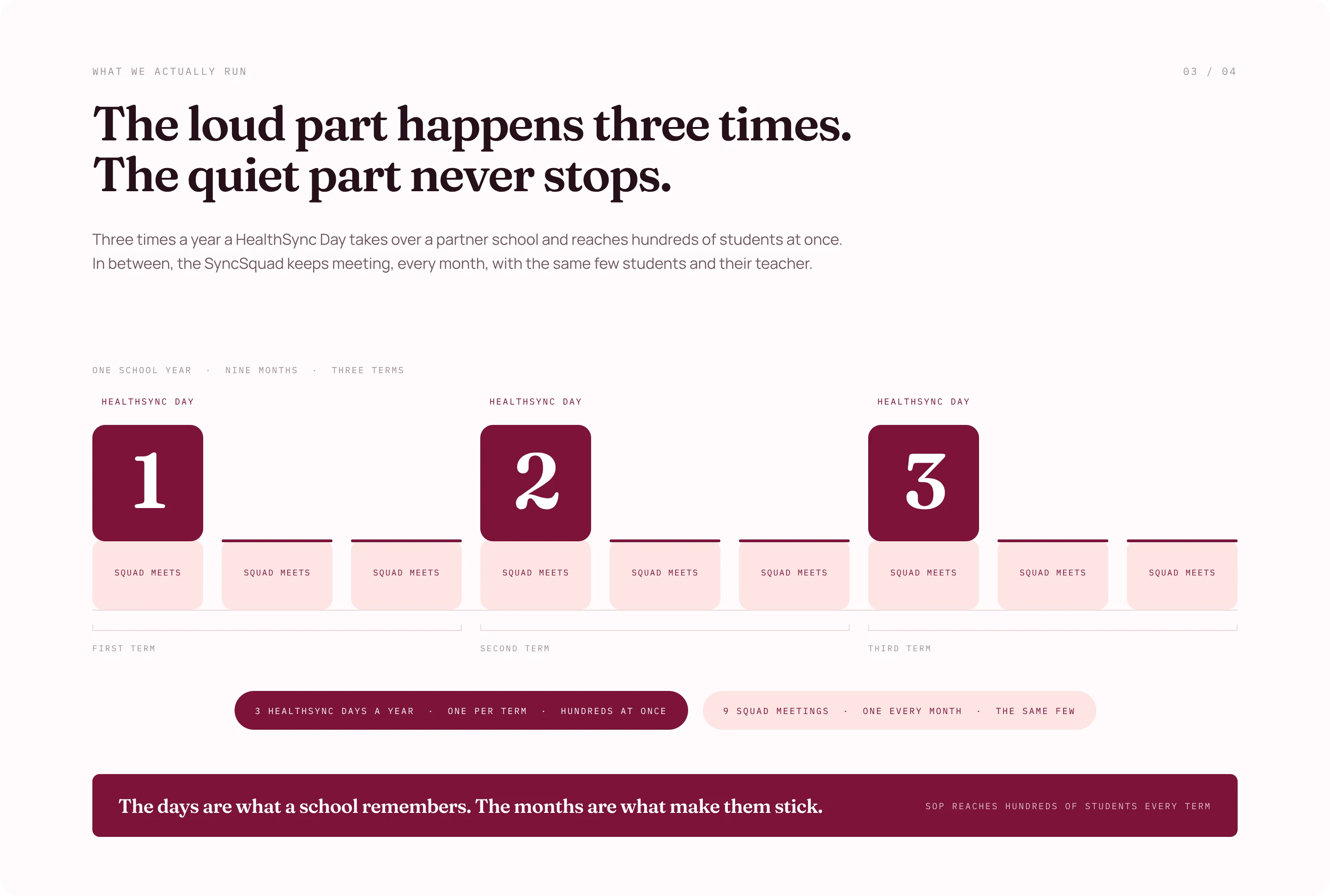
This is section three of the School Outreach page. Six answers to the same question, all of them drawn out properly before any of them was judged.
The first two are not even versions of the section that shipped. They were a section we invented, ran at for a while, and then cut entirely. The last four are the line that survived.
Mind you, there are like seven pages.
1 / 6 · one section, six answers
A and B are off a board still marked RETIRED, section cut. Two days of work that exists nowhere on the live site.
The dashboard
Will I now use pink in the dashboard too? Oh chim.
Then the dashboard part, where everything you submit or pay for on Synced Cancer goes. That took some time.
But I had to. The client had to feel like the public site and the dashboard are one product, connected, and not two things that happen to belong to the same org.
I started with the infra, which is the very important part. This is a small team and she did not want stress, so I had to find alternatives that work for their traffic and their setup. Neon, tRPC, Netlify, Drizzle ORM and BetterAuth all work for her setup.
Then the custom dashboard system for her and her team. She can add team members as editors and admins, publish posts, and look at donations, stories, speakers, volunteers and contact messages. All in one place.
If you remember from the start, she was juggling five platforms to run her whole organization. Now she logs into one dashboard, owned by her org, sees everything going on, and acts on it. Replies people. The whole bit.
All at no cost per month, unless there is an insane spike in visitors.
Solo
I soloed this whole thing myself.
As the designer and the engineer. As the design engineer. It was fun, amazing, everything.
This project was one where I had to design for everyone. The youth, the serious, everyone.
Client relationship is and was a ten out of ten. She was incredibly easy to work with.
This client trusted me through and through, and I absolutely delivered all the way. That could be you.
Thank you.
Start something